0.1 R 语言画带箭头的坐标轴
本质的方法:就是去掉原有的坐标轴,然后通过R的低等函数一步一步的画出坐标轴以及需要的曲线,以下是google到的几种方法:
0.1.1 方法一
##################  画带箭头的坐标轴
## estimate curve
x <- seq(-1,1.5,0.1);
y <- c(1.3,1.32,1.33,1.32,1.25,1.1,0.7,0.5,0.4,0.38,0.4,0.41,0.42,0.43,0.44,0.4,0.3,0.1,0,-0.05,-0.1,-0.15,-0.2,-0.24,-0.28,-0.3);
f <- splinefun(x,y);

## calculate precise points along estimated curve
x <- seq(-1,1.5,0.01);
y <- f(x);

## precompute limits
xlim <- c(min(x),max(x));
ylim <- c(min(y)-0.4,max(y)+0.2);

## set global plot params
par(xaxs='i',yaxs='i',mar=c(1,1,3,3)+0.1); ## "internal" axis spacing, meaning no extended range, and slightly adjust margins

## draw plot
plot(NA,xlim=xlim,ylim=ylim,axes=F,ann=F); ## set plot bounds, no default ornaments
arrows(c(0,xlim[1]),c(ylim[1],0),c(0,xlim[2]),c(ylim[2],0),0.05); ## draw custom axes
mtext('y',3,1,at=0,las=1,cex=0.8,family='serif'); ## y label
mtext('x',4,1,at=0,las=1,cex=0.8,family='serif'); ## x label
lines(x,y,col='#aaaacc'); ## draw line on top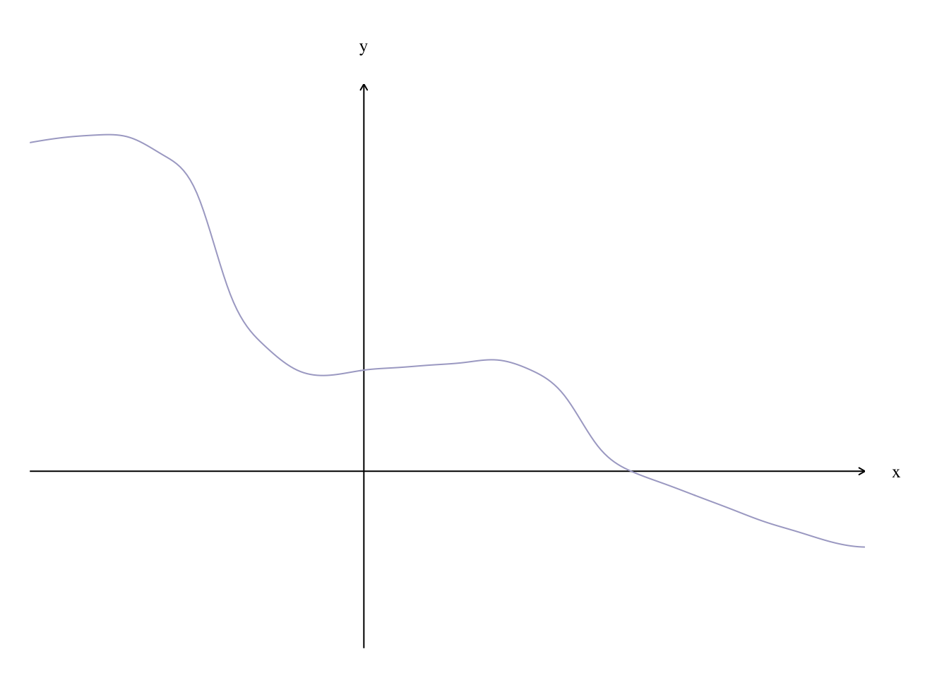
0.1.2 方法二:
##  Simulate your data:
x <- seq(-1, 3, by=0.01)
y <- 0.5*x - 0.3*x^2 + 0.4*x^3

##  Plot the polynomial function, removing axis ticks and bounding box,
##    as well as the axis labels:
plot(x, y,
     type="l",
     xaxt='n', yaxt='n',
     bty='n',
     xlab='', ylab='',
     col="blue")# 画图

##  Next add in your axis arrows:
# 适当缩小坐标轴
small = 0.9
arrows(min(x)*small, 0, max(x)*small, 0, lwd=1, length=0.15)
arrows(0, min(y)*small, 0, max(y)*small, lwd=1, length=0.15)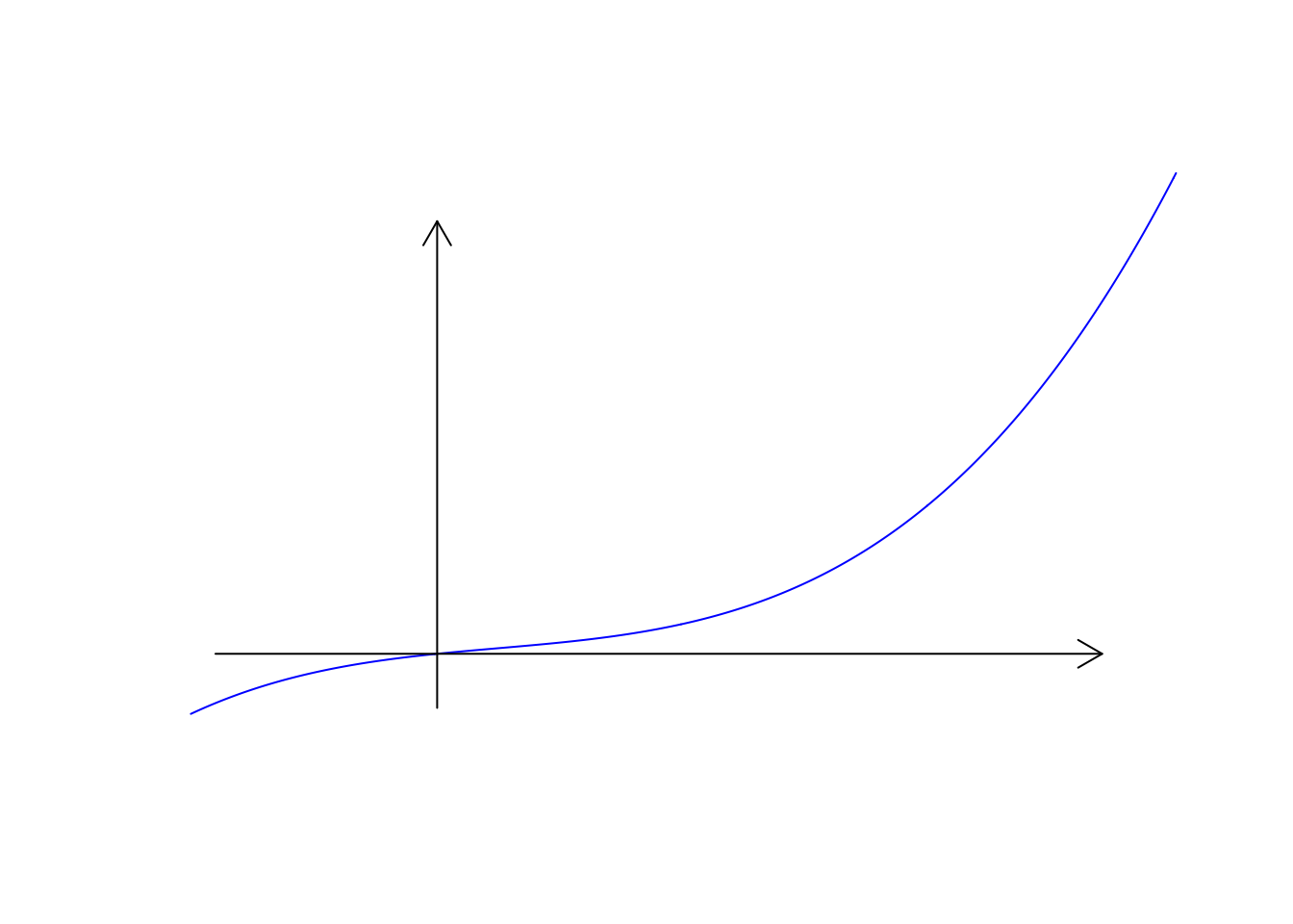
0.1.3 方法三
在方法二的基础上进行进一步修改
##  Simulate your data:
x <- seq(-1, 3, by=0.01)
y <- 0.5*x - 0.3*x^2 + 0.4*x^3

##  Plot the polynomial function, removing axis ticks and bounding box,
##    as well as the axis labels:
plot(x, y,
     type="l",
     xaxt='n', yaxt='n',
     bty='n',
     xlab='', ylab='',
     col="blue")# 画图

##  Next add in your axis arrows:
# 适当缩小坐标轴
small = 0.9
arrows(min(x)*small, 0, max(x)*small, 0, lwd=1, length=0.15)
arrows(0, min(y)*small, 0, max(y)*small, lwd=1, length=0.15)
par(family='STKaiti')

text(max(x), (max(y) - min(y))*0.1,'X轴')

text((max(x)-min(x))*0.1, max(y),'Y轴')

# 画标度---x 标度
k1 =ceiling(range(x)[1]*small)
k2 = floor(range(x)[2] *small )
k = 0.5 #k为刻度
for (i in seq(k1,k2,k)) {
  n=10
  if(i == 0 ) next()
  lines(rep(i,n),seq(0,k*0.3,length.out = n),type = "l")# 垂直X轴的直线长度

  text(i,-(max(x) - min(x) )*0.1,i)

}


# 画标度---y 标度
k1 =ceiling(range(y)[1]*small)
k2 = floor(range(y)[2]*small)
k = 1
for (i in seq(k1,k2,k)) { # 坐标轴的间隔,以1为单位,k为刻度
  n=10
  if(i == 0 ) next()
  lines(seq(0,k*0.01,length.out = n),rep(i,n),type = "l")
  text(-0.02*(max(x)-min(x) ),i,i)
}
## 画原点
text(-(max(x) - min(x))*0.03,-(max(y) - min(y))*0.03,"O",cex=1.3)
0.2 基本函数画多折线图
t = seq(1,10,length.out = 10000)
matplot(t,cbind(sin(t),cos(t)),type ='b',pch = 19,cex = 0.1)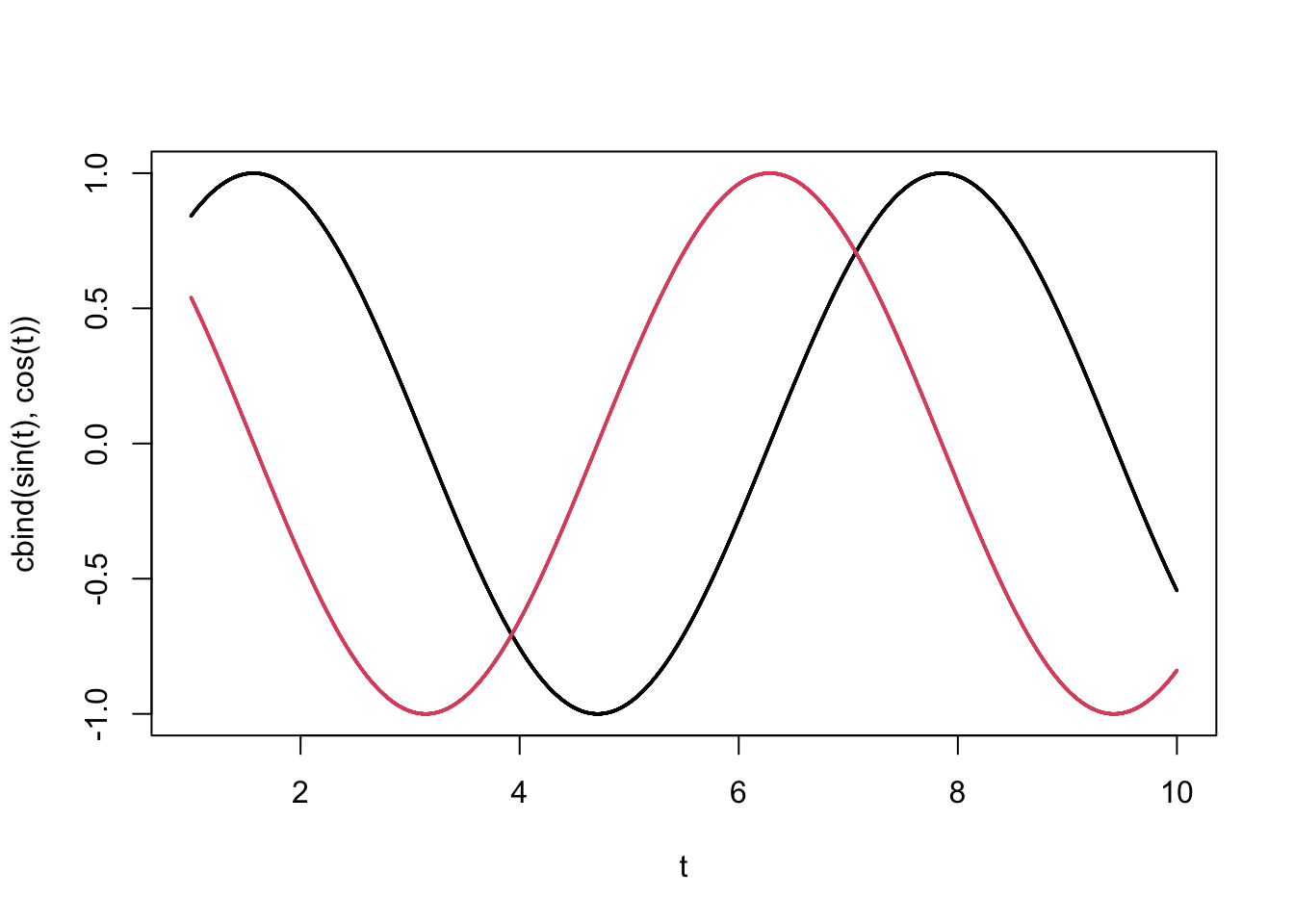
sessionInfo()
#> R version 4.0.2 (2020-06-22)
#> Platform: x86_64-apple-darwin17.0 (64-bit)
#> Running under: macOS Mojave 10.14.5
#>
#> Matrix products: default
#> BLAS:   /Library/Frameworks/R.framework/Versions/4.0/Resources/lib/libRblas.dylib
#> LAPACK: /Library/Frameworks/R.framework/Versions/4.0/Resources/lib/libRlapack.dylib
#>
#> locale:
#> [1] zh_CN.UTF-8/zh_CN.UTF-8/zh_CN.UTF-8/C/zh_CN.UTF-8/zh_CN.UTF-8
#>
#> attached base packages:
#> [1] stats     graphics  grDevices utils     datasets  methods   base
#>
#> loaded via a namespace (and not attached):
#>  [1] compiler_4.0.2  magrittr_1.5    bookdown_0.20   tools_4.0.2
#>  [5] htmltools_0.5.0 yaml_2.2.1      stringi_1.4.6   rmarkdown_2.3
#>  [9] blogdown_0.20   knitr_1.29      stringr_1.4.0   digest_0.6.25
#> [13] xfun_0.17       rlang_0.4.7     evaluate_0.14