ggfortify 是一个简单易用的R软件包,它可以仅仅使用一行代码来对许多受欢迎的R软件包结果进行二维可视化,这让统计学家以及数据科学家省去了许多繁琐和重复的过程,不用对结果进行任何处理就能以 ggplot 的风格画出好看的图,大大地提高了工作的效率。
接下来我将简单介绍一下怎么用 ggplot2 和 ggfortify 来很快地对PCA、聚类以及LFDA的结果进行可视化,然后将简单介绍用 ggfortify 来对时间序列进行快速可视化的方法。一下都是个人理解,
1、PCA (主成分分析)
其实本包,大多数画图都是采用主成分(不包括因子分析)降维得到两个主成分,在进一步使其主成分为坐标,对应与每个点给出相应的颜色和类别
ggfortify 使 ggplot2 知道怎么诠释PCA对象。加载好 ggfortify 包之后, 你可以对stats::prcomp 和stats::princomp对象使用 ggplot2::autoplot。
autoplot()函数是ggplot2中的,不过ggfortify包里面有泛函s3类的autoplot解释这个函数
ggbiplot()函数中的参数就是autoplot()函数中的参数
autoplot(object, data = NULL, scale = 1, x = 1, y = 2, ...)

object                          :  对象
data                            :  对应的数据框
colour = 'Species'              :  若有分类因子变量,可以对不同的类别添加颜色,当为连续值时为逐渐变色
shape = FALSE                   : 调整点的形状,可以让所有的点消失,只留下标识(可以为具体的数字,就是形状类型)
main    、xlab   、ylab            : 标题
label = TRUE
      label.size = 3            :  可以给每个点加上标识(以rownames为标准),也可以调整标识的大小.(默认为FALSE)
      label.label               :  标识标签(默认rownames)
      label.colour              :  文本标签的颜色
      label.alpha               : 透明度
      label.angle               : 旋转的角度
      label.family              :  字体
      label.fontface
      label.lineheight
      label.hjust
      label.vjust
      label.repel


loadings = TRUE                 : 可以很快地画出特征向量
      loadings.colour = 'blue'  : 特征向量的颜色
      loadings.label = TRUE     :  特征向量的标识(默认为特征向量的名字)
          loadings.label.size = 3   :  特征向量的大小
          loadings.label.label      :
          loadings.label.colour
          loadings.label.alpha
          loadings.label.angle
          loadings.label.family
          loadings.label.fontface
          loadings.label.lineheight
          loadings.label.hjust
          loadings.label.vjust
          loadings.label.repel


frame = TRUE                    : 可以把每个类圈出来。图中没有分类则看成一类,全部圈出来(支持 stats::kmeans 和 cluster::* 等等)
      frame.colour = 'Species'   :  对分类变量进行颜色标注,并把它们类别圈出来(类似colour = 'Species'  )
      frame.type = 't'          : 选择圈的类型(默认多边形)
      frame.level
      frame.alpha
library(ggfortify)
df <- iris[c(1, 2, 3, 4)]
autoplot(prcomp(df))#等价autoplot(prcomp(iris[-5]), data = iris)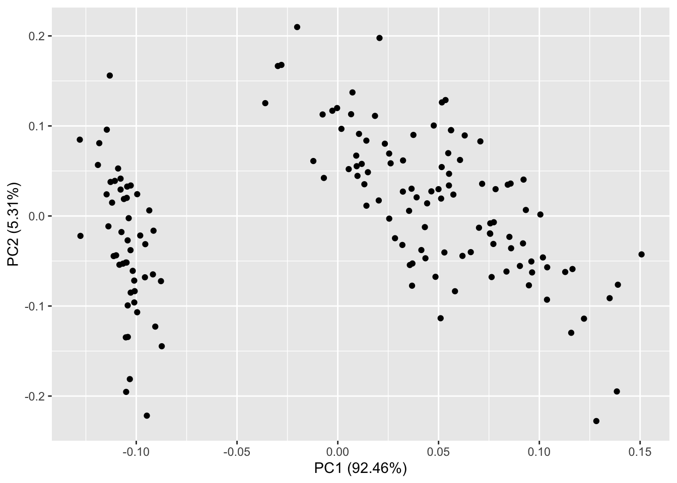
你还可以选择数据中的一列来给画出的点按类别自动分颜色。输入help(autoplot.prcomp) 可以了解到更多的其他选择。
autoplot(prcomp(df), data = iris, colour = 'Species')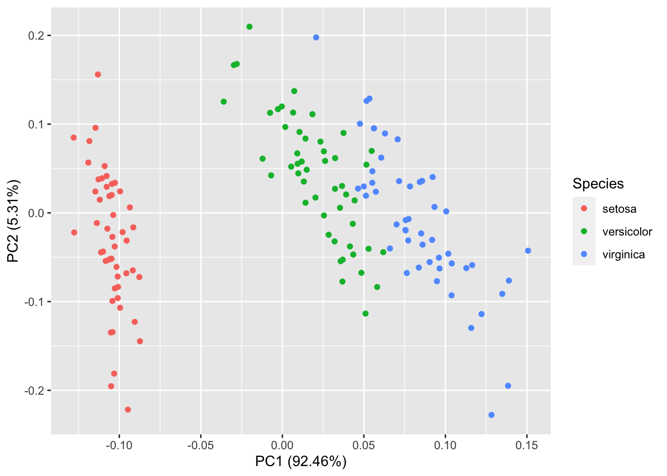
比如说给定label = TRUE 可以给每个点加上标识(以rownames为标准),也可以调整标识的大小。
autoplot(prcomp(df), data = iris, colour = 'Species', label = TRUE,label.size = 3)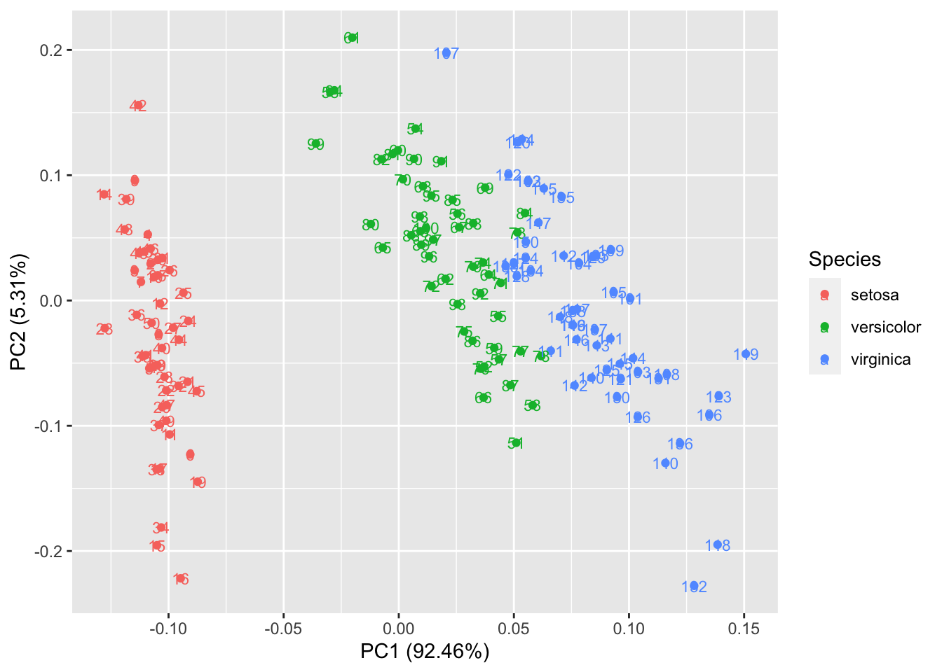
给定 shape = FALSE 可以让所有的点消失,只留下标识,这样可以让图更清晰,辨识度更大。
autoplot(prcomp(df), data = iris, colour = 'Species', shape =14,label.size = 3,label = TRUE)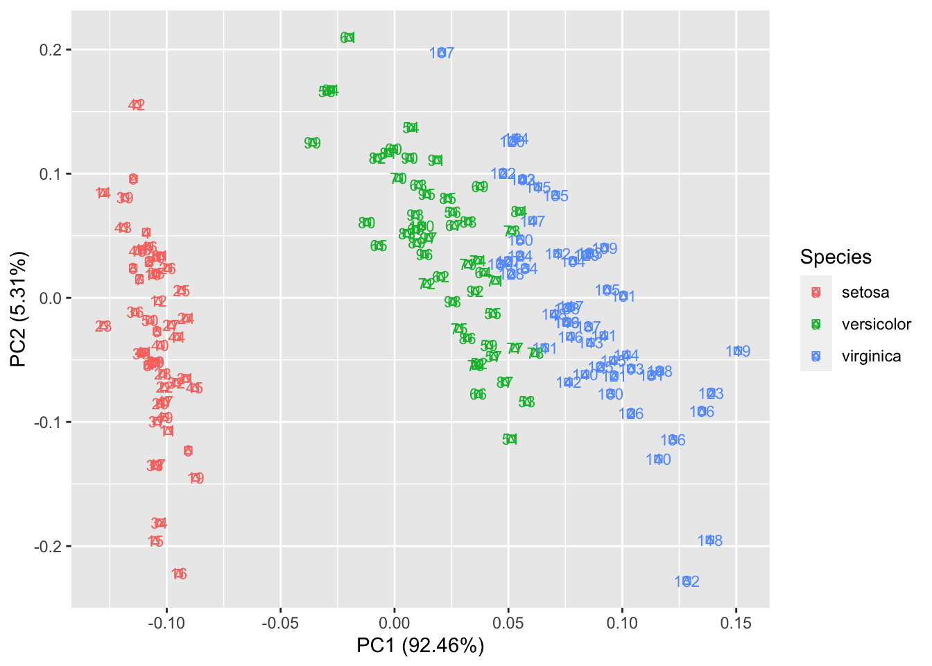 给定 loadings = TRUE 可以很快地画出特征向量。
autoplot(prcomp(df), data = iris, colour = 'Species', loadings = TRUE)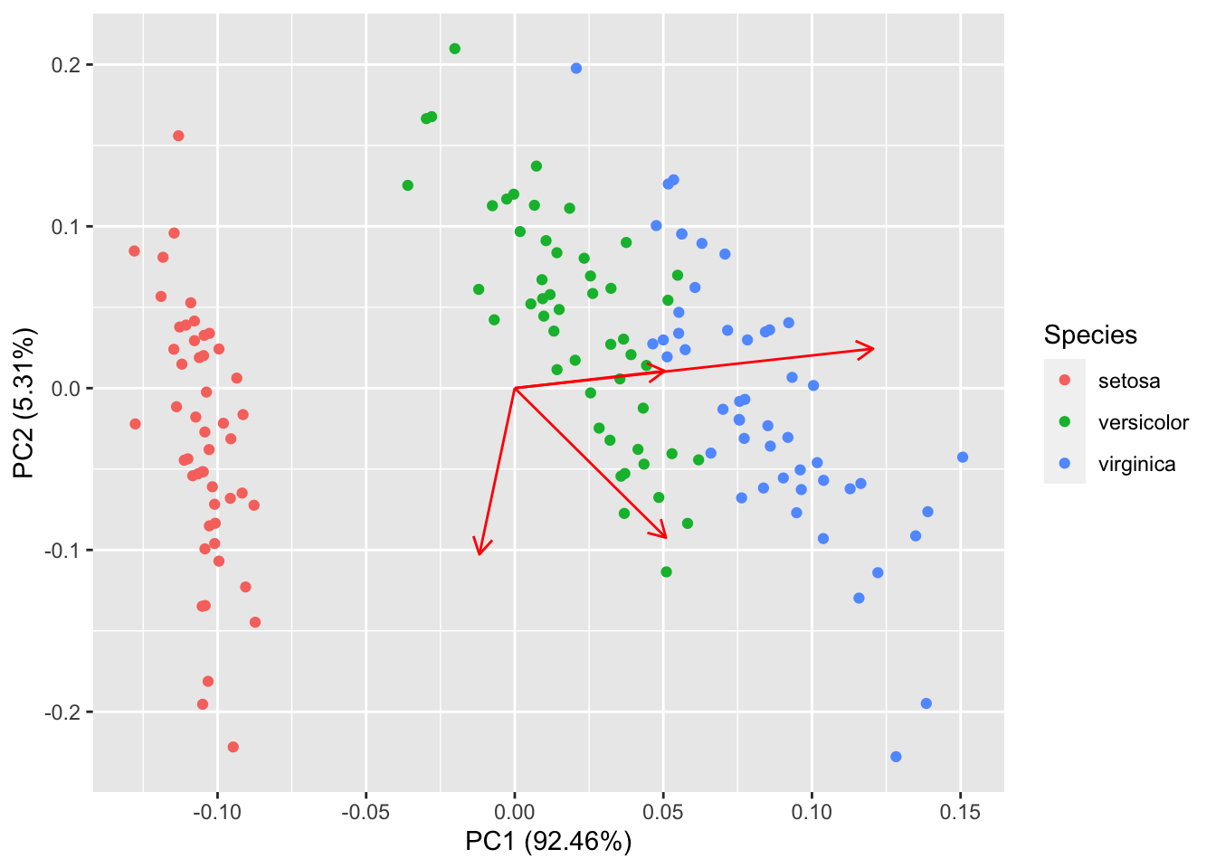
同样的,你也可以显示特征向量的标识以及调整他们的大小,更多选择请参考帮助文件。
autoplot(prcomp(df), data = iris, colour = 'Species',
         loadings = TRUE, loadings.colour = 'blue',
         loadings.label = TRUE, loadings.label.size = 3)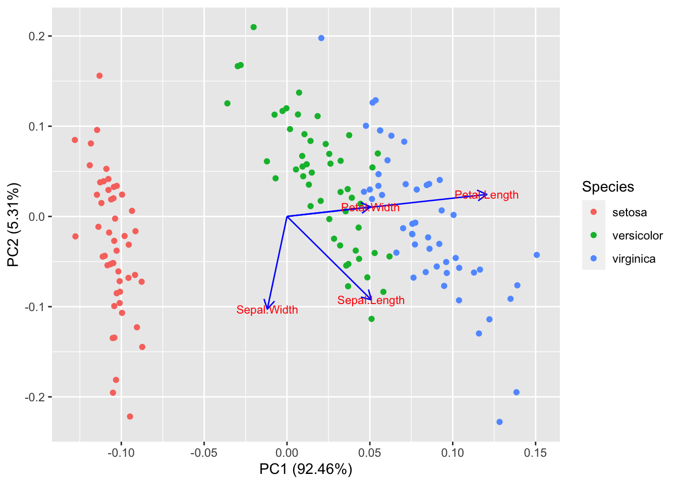
2、因子分析
和PCA类似,ggfortify 也支持 stats::factanal 对象。可调的选择也很广泛。以下给出了简单的例子: 注意 当你使用 factanal 来计算分数的话,你必须给定 scores 的值。 下面都是建立在因子分析模型上,但是几乎参数和主成分分析一样。。
#因子分析 ,记住3个因子和2个因子画出来的图是不一样的

(d.factanal <- factanal(state.x77, factors = 3, scores = 'regression'))#因子分析,
##
## Call:
## factanal(x = state.x77, factors = 3, scores = "regression")
##
## Uniquenesses:
## Population Income Illiteracy Life Exp Murder HS Grad Frost
## 0.813 0.474 0.266 0.240 0.050 0.167 0.005
## Area
## 0.613
##
## Loadings:
## Factor1 Factor2 Factor3
## Population -0.156 0.361 0.181
## Income 0.316 0.651
## Illiteracy -0.576 0.543 -0.328
## Life Exp 0.856 -0.128 0.103
## Murder -0.854 0.459 0.103
## HS Grad 0.576 -0.149 0.692
## Frost 0.137 -0.966 0.209
## Area -0.184 0.593
##
## Factor1 Factor2 Factor3
## SS loadings 2.301 1.612 1.459
## Proportion Var 0.288 0.201 0.182
## Cumulative Var 0.288 0.489 0.671
##
## Test of the hypothesis that 3 factors are sufficient.
## The chi square statistic is 20.47 on 7 degrees of freedom.
## The p-value is 0.00464#图的坐标应该和因子有关系,但是因子为3个的时候,图中有时怎么表达的呢?
autoplot(d.factanal, data = state.x77, colour = 'Income')# colour为连续值(data、和colour只是纯粹的添加颜色而已)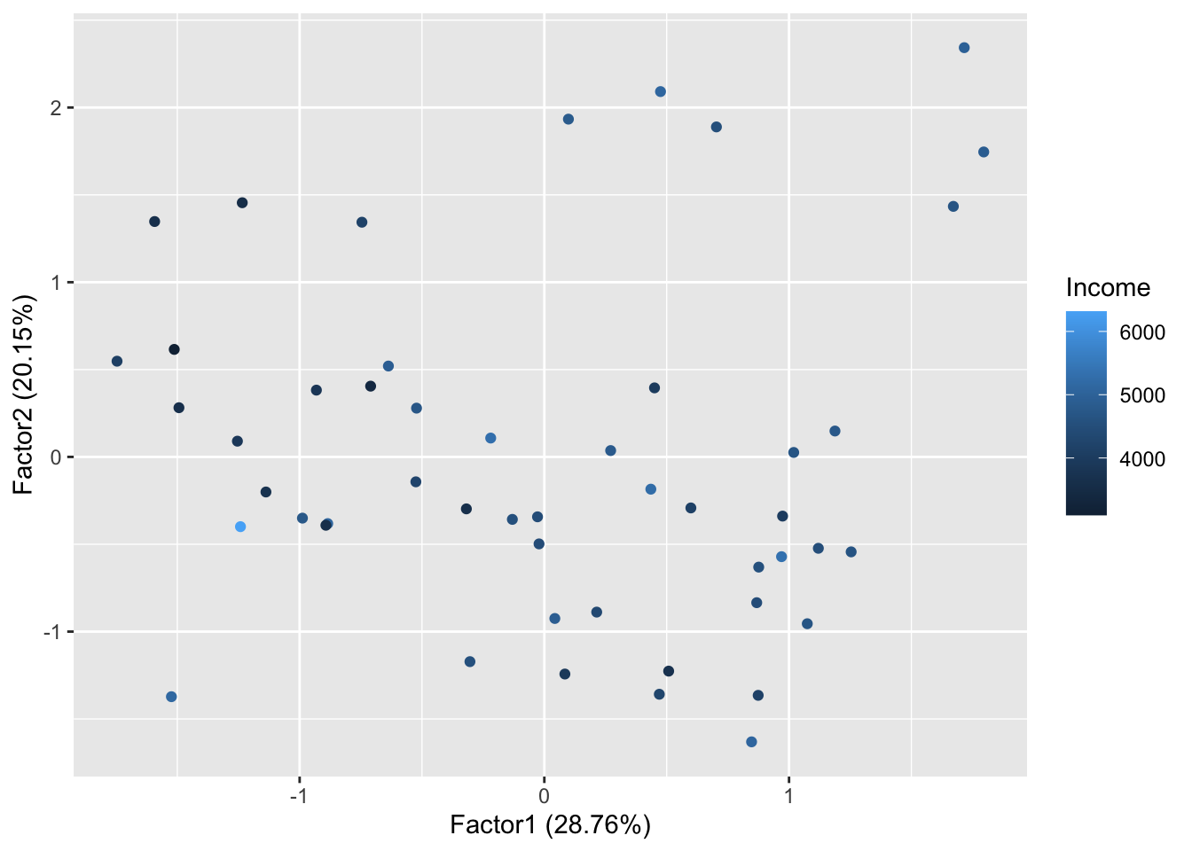
autoplot(d.factanal, label = TRUE, label.size = 3,
         loadings = TRUE, loadings.label = TRUE, loadings.label.size  = 3)#把特征向量画出来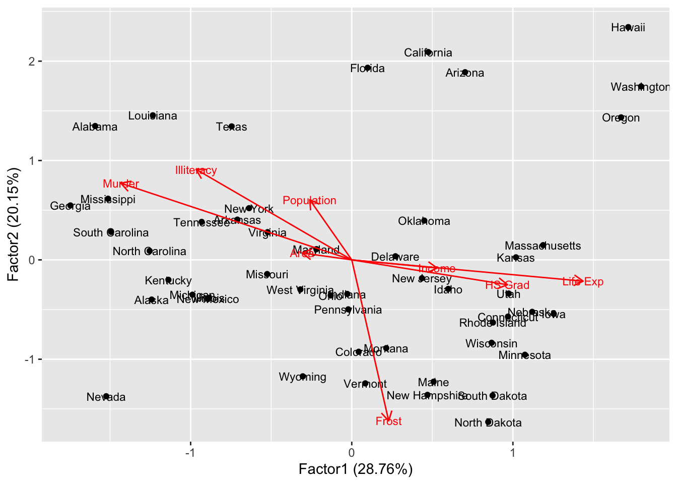
3、聚类
3.1K-均值聚类—–若是聚类的话(自带类别,会自动画出颜色分类)
和因子分析、主成分类似
autoplot(kmeans(iris[,-5], 3), data = iris)#坐标用的是主成分的坐标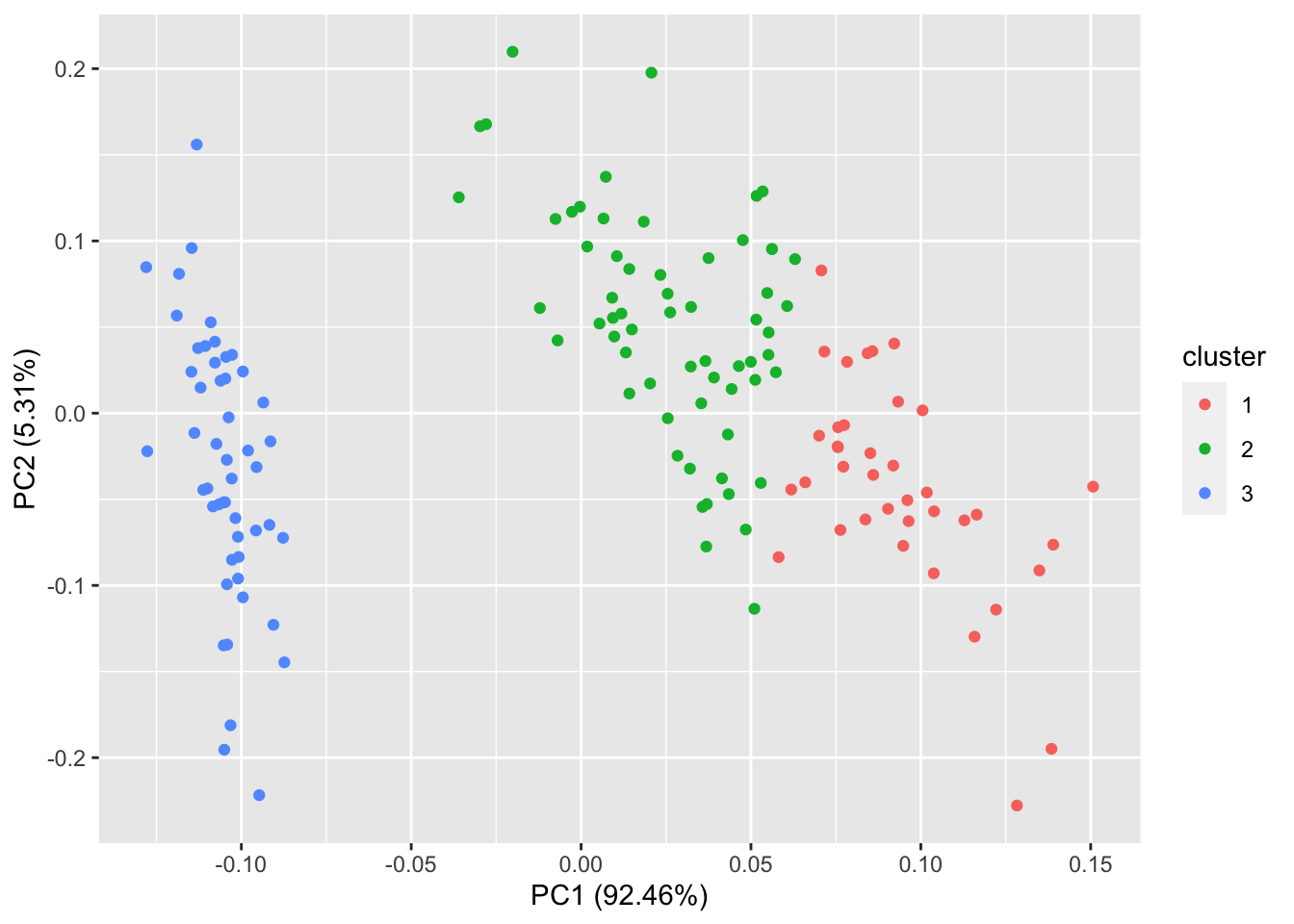
autoplot(kmeans(iris[,-5], 3), data = iris, label = TRUE, label.size = 3)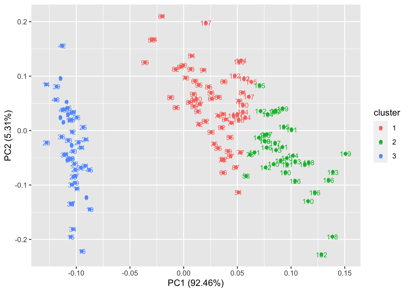
3.2其他聚类
ggfortify 也支持 cluster::clara, cluster::fanny, cluster::pam。
其实本包,大多数画图都是采用主成分(不包括因子分析)降维得到两个主成分,在进一步使其主成分为坐标,对应与每个点给出相应的颜色和类别
library(cluster)
autoplot(clara(iris[-5], 3))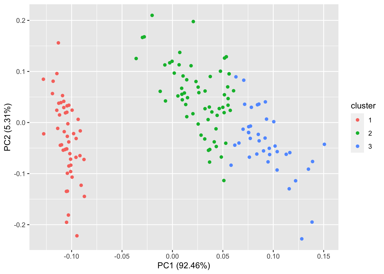
autoplot(fanny(iris[-5], 3), frame = TRUE)#给定 frame = TRUE,可以把stats::kmeans 和 cluster::* 的每个集群圈出来。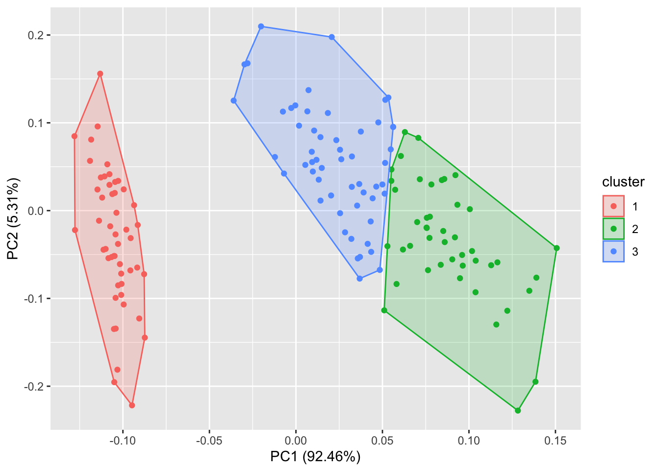
autoplot(pam(iris[-5], 3), frame = TRUE, frame.type = 'norm')#你也可以通过 frame.type 来选择圈的类型。更多选择请参照ggplot2::stat_ellipse里面的frame.type的type关键词。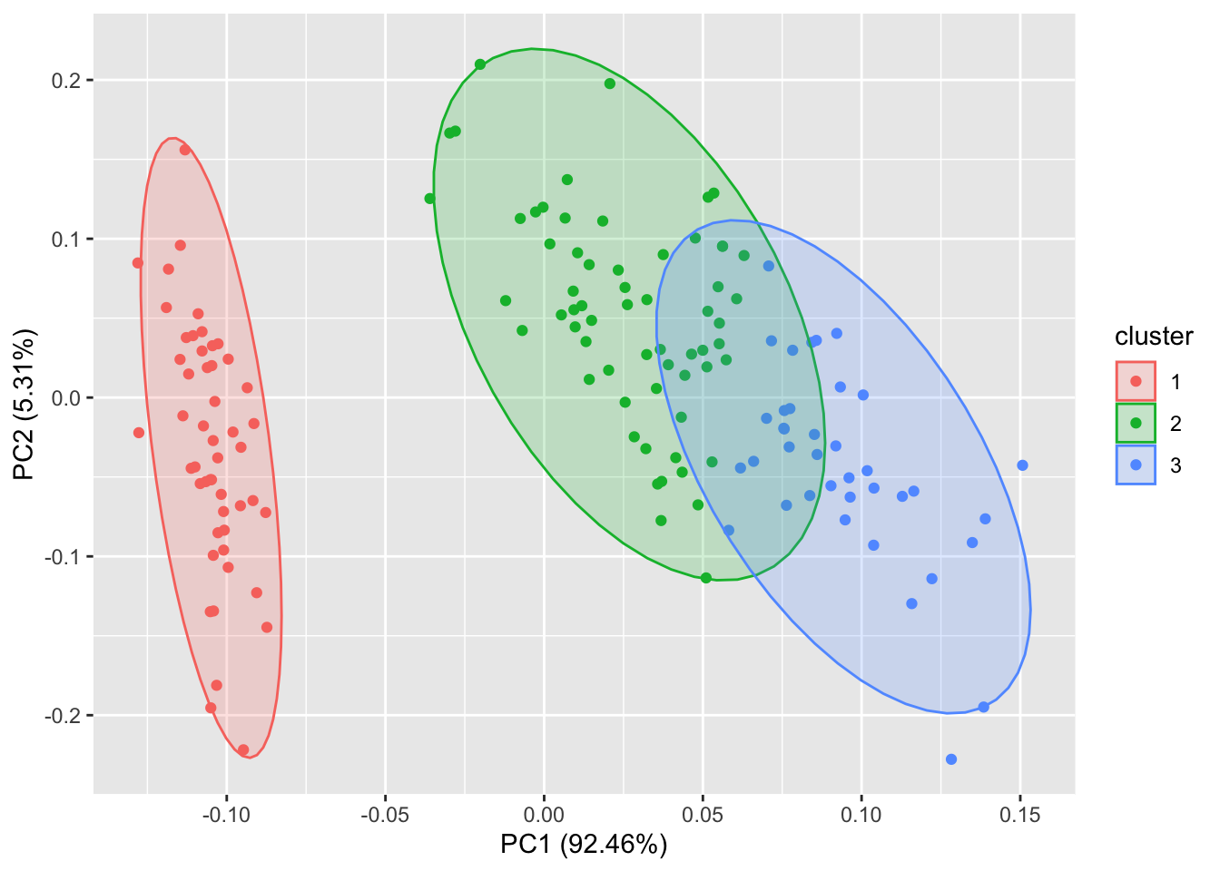
3.3、lfda(Fisher局部判别分析)
lfda包支持一系列的Fisher局部判别分析方法,包括半监督lfda,非线性lfda。你也可以使用{ggfortify}来对他们的结果进行可视化。
library(lfda)
# Fisher局部判别分析 (LFDA)
model <- lfda(iris[-5], iris[, 5], 4, metric="plain")
autoplot(model, data = iris, frame = TRUE, frame.colour = 'Species')#给定 frame = TRUE,可以把 stats::kmeans 和 cluster::* 中的每个类圈出来。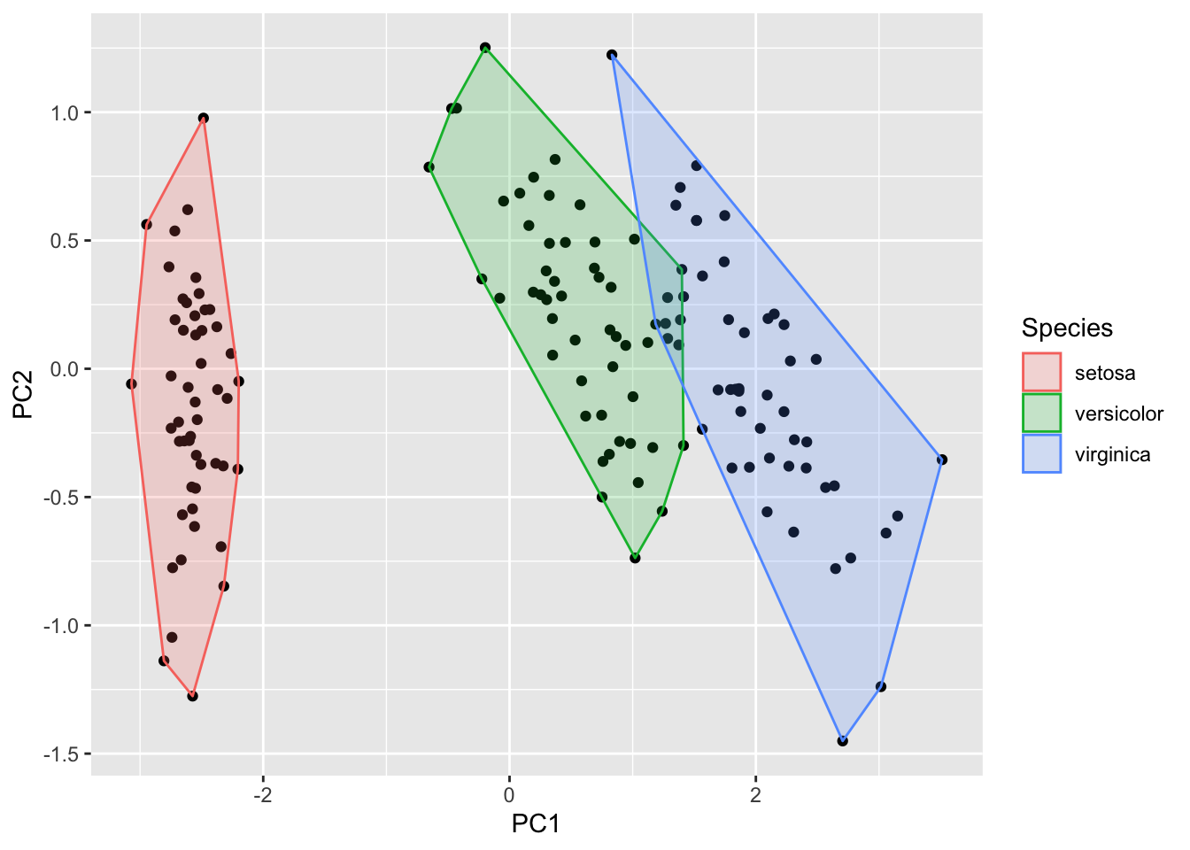
# 半监督Fisher局部判别分析 (SELF)
model <- self(iris[-5], iris[, 5], beta = 0.1, r = 3, metric="plain")
autoplot(model, data = iris, frame = TRUE, frame.colour = 'Species')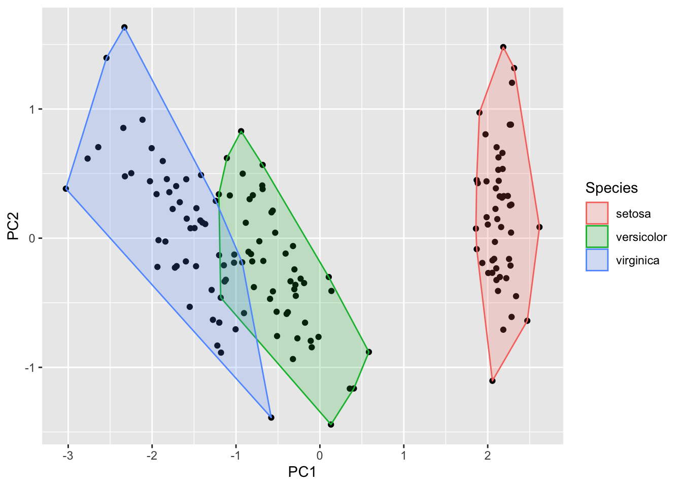
4、时间序列的可视化
用 {ggfortify} 使时间序列的可视化变得及其简单。接下来我将给出一些简单的例子。
autoplot可支持的R包有:- 基本stats:: ts对象
- zoo::zooreg
- xts::xts
- timeSeries::timSeries
- tseries::irts
4.1、ts对象
library(ggfortify)
class(AirPassengers)#时间序列的对象为ts
## [1] "ts"AirPassengers## Jan Feb Mar Apr May Jun Jul Aug Sep Oct Nov Dec
## 1949 112 118 132 129 121 135 148 148 136 119 104 118
## 1950 115 126 141 135 125 149 170 170 158 133 114 140
## 1951 145 150 178 163 172 178 199 199 184 162 146 166
## 1952 171 180 193 181 183 218 230 242 209 191 172 194
## 1953 196 196 236 235 229 243 264 272 237 211 180 201
## 1954 204 188 235 227 234 264 302 293 259 229 203 229
## 1955 242 233 267 269 270 315 364 347 312 274 237 278
## 1956 284 277 317 313 318 374 413 405 355 306 271 306
## 1957 315 301 356 348 355 422 465 467 404 347 305 336
## 1958 340 318 362 348 363 435 491 505 404 359 310 337
## 1959 360 342 406 396 420 472 548 559 463 407 362 405
## 1960 417 391 419 461 472 535 622 606 508 461 390 432autoplot(AirPassengers)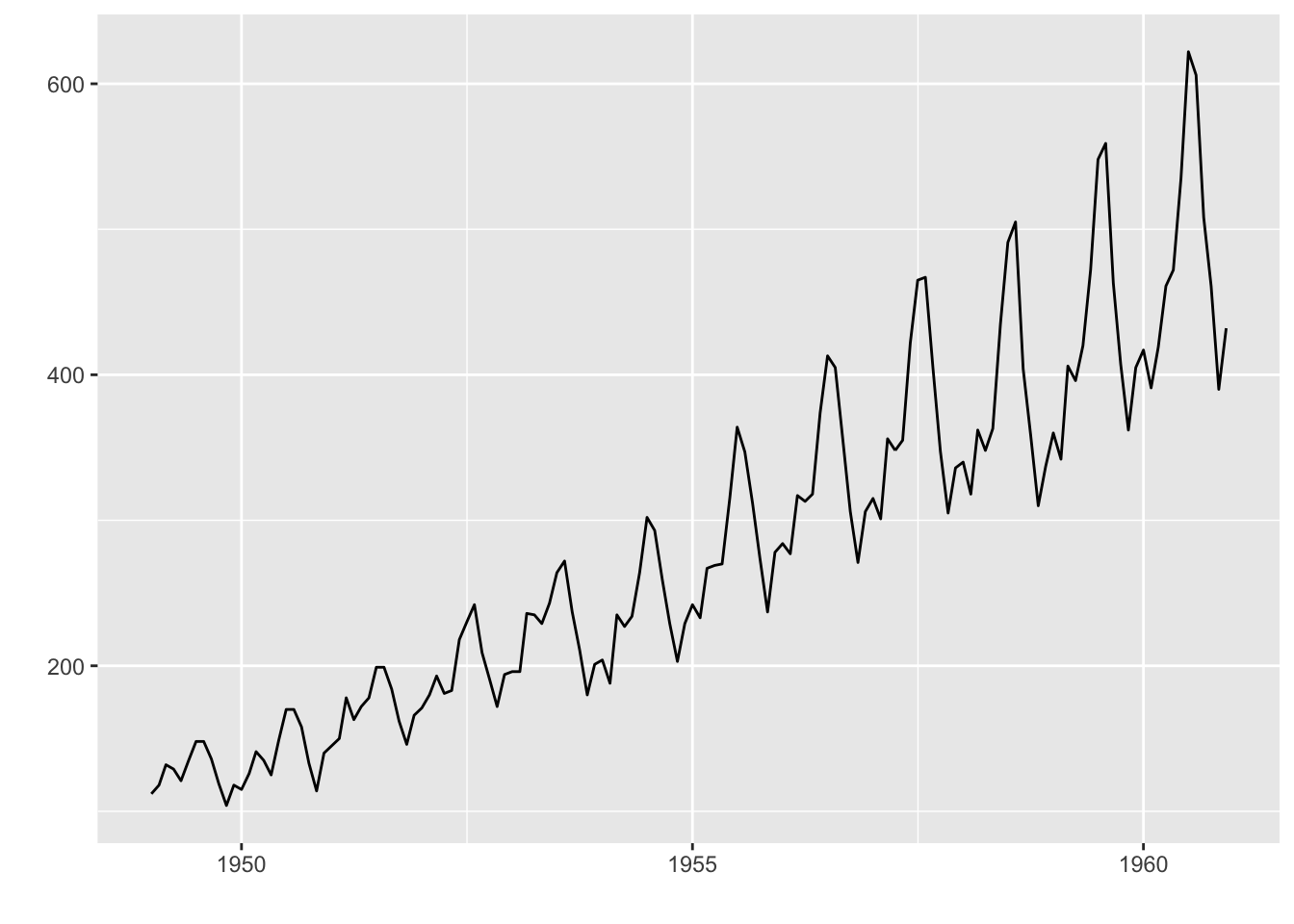
#可以使用 ts.colour 和 ts.linetype来改变线的颜色和形状。更多的选择请参考 help(autoplot.ts)。
# 也可以像ggplot函数那样设置样式,比如
autoplot(AirPassengers, ts.colour = 'red', ts.linetype = 'dashed',xlab = "时间",ylab = "飞机乘客数量",main= "飞机乘客人数的变化")
#等价
autoplot(AirPassengers, ts.colour = 'red', ts.linetype = 'dashed')+xlab("时间")+ylab("飞机乘客数量")+ggtitle( "飞机乘客人数的变化")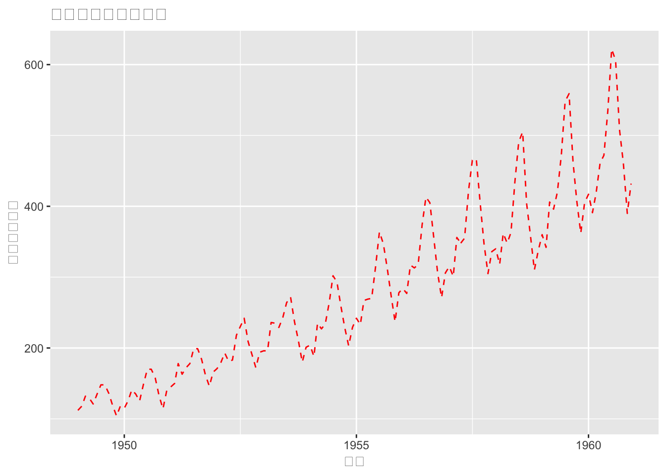
4.1.1、多变量时间序列
library(vars)
data(Canada)
class(Canada)
## [1] "mts" "ts"Canada## e prod rw U
## 1980 Q1 929.6105 405.3665 386.1361 7.53
## 1980 Q2 929.8040 404.6398 388.1358 7.70
## 1980 Q3 930.3184 403.8149 390.5401 7.47
## 1980 Q4 931.4277 404.2158 393.9638 7.27
## 1981 Q1 932.6620 405.0467 396.7647 7.37
## 1981 Q2 933.5509 404.4167 400.0217 7.13
## 1981 Q3 933.5315 402.8191 400.7515 7.40
## 1981 Q4 933.0769 401.9773 405.7335 8.33
## 1982 Q1 932.1238 402.0897 409.0504 8.83
## 1982 Q2 930.6359 401.3067 411.3984 10.43
## 1982 Q3 929.0971 401.6302 413.0194 12.20
## 1982 Q4 928.5633 401.5638 415.1670 12.77
## 1983 Q1 929.0694 402.8157 414.6621 12.43
## 1983 Q2 930.2655 403.1421 415.7319 12.23
## 1983 Q3 931.6770 403.0786 416.2315 11.70
## 1983 Q4 932.1390 403.7188 418.1439 11.20
## 1984 Q1 932.2767 404.8668 419.7352 11.27
## 1984 Q2 932.8328 405.6362 420.4842 11.47
## 1984 Q3 933.7334 405.1363 420.9309 11.30
## 1984 Q4 934.1772 406.0246 422.1124 11.17
## 1985 Q1 934.5928 406.4123 423.6278 11.00
## 1985 Q2 935.6067 406.3009 423.9887 10.63
## 1985 Q3 936.5111 406.3354 424.1902 10.27
## 1985 Q4 937.4201 406.7737 426.1270 10.20
## 1986 Q1 938.4159 405.1525 426.8578 9.67
## 1986 Q2 938.9992 404.9298 426.7457 9.60
## 1986 Q3 939.2354 404.5765 426.8858 9.60
## 1986 Q4 939.6795 404.1995 428.8403 9.50
## 1987 Q1 940.2497 405.9499 430.1223 9.50
## 1987 Q2 941.4358 405.8221 430.2307 9.03
## 1987 Q3 942.2981 406.4463 430.3930 8.70
## 1987 Q4 943.5322 407.0512 432.0284 8.13
## 1988 Q1 944.3490 407.9460 433.3886 7.87
## 1988 Q2 944.8215 408.1796 433.9641 7.67
## 1988 Q3 945.0671 408.5998 434.4844 7.80
## 1988 Q4 945.8067 409.0906 436.1569 7.73
## 1989 Q1 946.8697 408.7042 438.2651 7.57
## 1989 Q2 946.8766 408.9803 438.7636 7.57
## 1989 Q3 947.2497 408.3287 439.9498 7.33
## 1989 Q4 947.6513 407.8857 441.8359 7.57
## 1990 Q1 948.1840 407.2605 443.1769 7.63
## 1990 Q2 948.3492 406.7752 444.3592 7.60
## 1990 Q3 948.0322 406.1794 444.5236 8.17
## 1990 Q4 947.1065 405.4398 446.9694 9.20
## 1991 Q1 946.0796 403.2800 450.1586 10.17
## 1991 Q2 946.1838 403.3649 451.5464 10.33
## 1991 Q3 946.2258 403.3807 452.2984 10.40
## 1991 Q4 945.9978 404.0032 453.1201 10.37
## 1992 Q1 945.5183 404.4774 453.9991 10.60
## 1992 Q2 945.3514 404.7868 454.9552 11.00
## 1992 Q3 945.2918 405.2710 455.4824 11.40
## 1992 Q4 945.4008 405.3830 456.1009 11.73
## 1993 Q1 945.9058 405.1564 457.2027 11.07
## 1993 Q2 945.9035 406.4700 457.3886 11.67
## 1993 Q3 946.3190 406.2293 457.7799 11.47
## 1993 Q4 946.5796 406.7265 457.5535 11.30
## 1994 Q1 946.7800 408.5785 458.8024 10.97
## 1994 Q2 947.6283 409.6767 459.0564 10.63
## 1994 Q3 948.6221 410.3858 459.1578 10.10
## 1994 Q4 949.3992 410.5395 459.7037 9.67
## 1995 Q1 949.9481 410.4453 459.7037 9.53
## 1995 Q2 949.7945 410.6256 460.0258 9.47
## 1995 Q3 949.9534 410.8672 461.0257 9.50
## 1995 Q4 950.2502 411.2359 461.3039 9.27
## 1996 Q1 950.5380 410.6637 461.4031 9.50
## 1996 Q2 950.7871 410.8085 462.9277 9.43
## 1996 Q3 950.8695 412.1160 464.6888 9.70
## 1996 Q4 950.9281 412.9994 465.0717 9.90
## 1997 Q1 951.8457 412.9551 464.2851 9.43
## 1997 Q2 952.6005 412.8241 464.0344 9.30
## 1997 Q3 953.5976 413.0489 463.4535 8.87
## 1997 Q4 954.1434 413.6110 465.0717 8.77
## 1998 Q1 954.5426 413.6048 466.0889 8.60
## 1998 Q2 955.2631 412.9684 466.6171 8.33
## 1998 Q3 956.0561 412.2659 465.7478 8.17
## 1998 Q4 956.7966 412.9106 465.8995 8.03
## 1999 Q1 957.3865 413.8294 466.4099 7.90
## 1999 Q2 958.0634 414.2242 466.9552 7.87
## 1999 Q3 958.7166 415.1678 467.6281 7.53
## 1999 Q4 959.4881 415.7016 467.7026 6.93
## 2000 Q1 960.3625 416.8674 469.1348 6.80
## 2000 Q2 960.7834 417.6104 469.3364 6.70
## 2000 Q3 961.0290 418.0030 470.0117 6.93
## 2000 Q4 961.7657 417.2667 469.6472 6.87autoplot(Canada)## 需要用到的数据集,包含e、prod、rw和U四个变量,自动把全部变量添加到图中,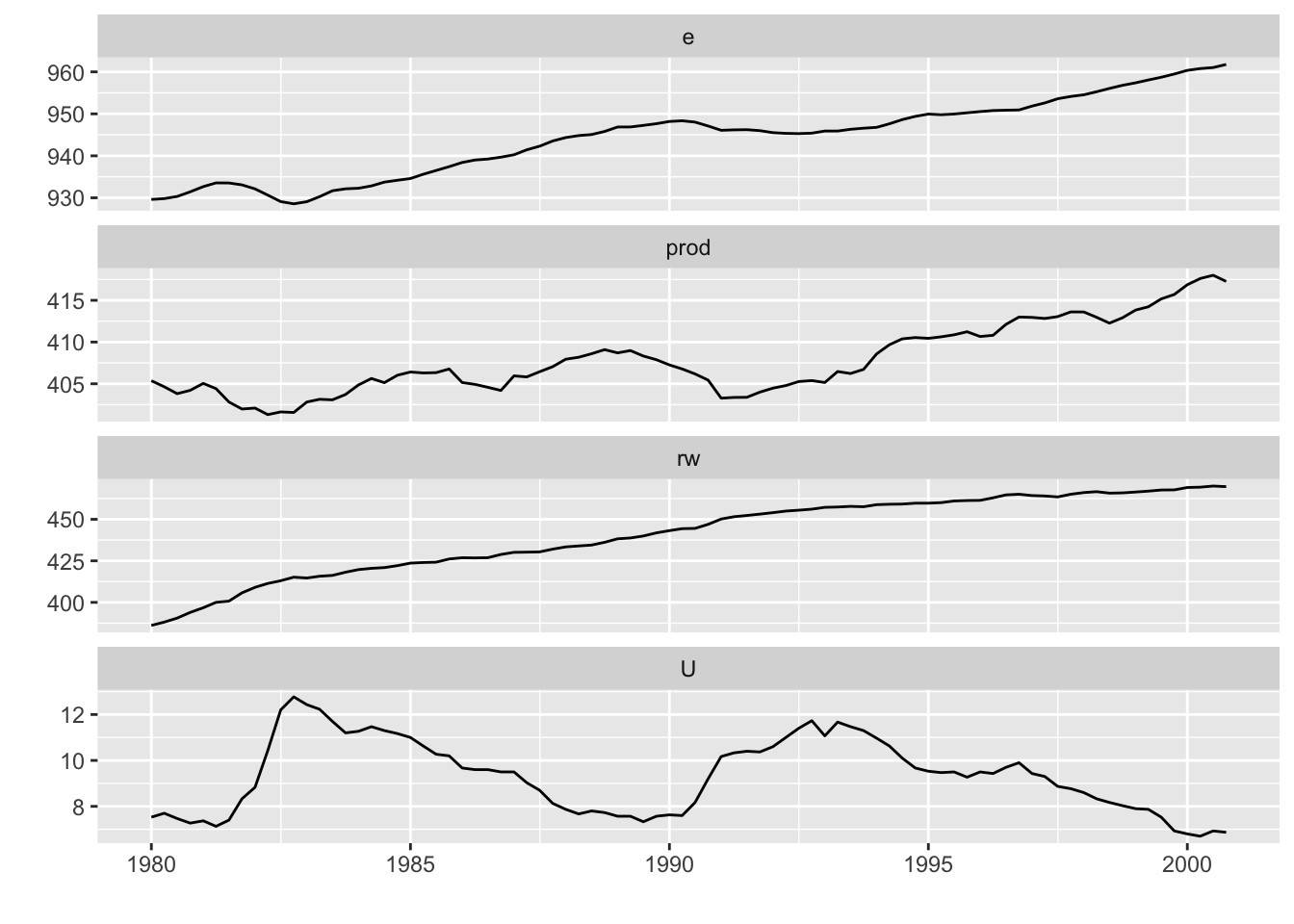
#也可以指定相应变量,画前面3列
autoplot(Canada[,-4])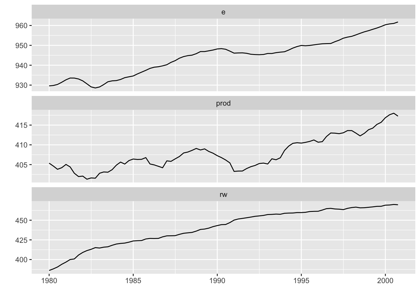
#使用 facets = FALSE 可以把所有变量画在一条轴上。
autoplot(Canada, facets = FALSE)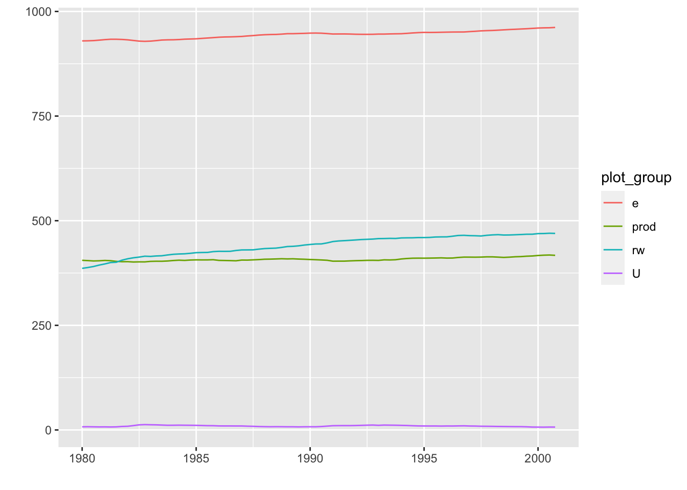
4.2 xts对象
library(xts)
autoplot(as.xts(AirPassengers),ts.colour = 'green')#好像出问题
4.3 timSeries对象
library(timeSeries)
autoplot(as.timeSeries(AirPassengers), ts.colour = ('dodgerblue3'))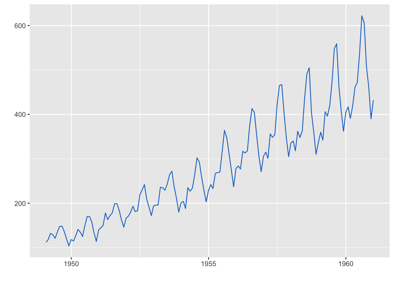
5、面板设计
library(purrr)
res <- purrr::map(c(3, 4, 5), ~ kmeans(iris[-5], .))
autoplot(res, data = iris[-5], ncol = 3)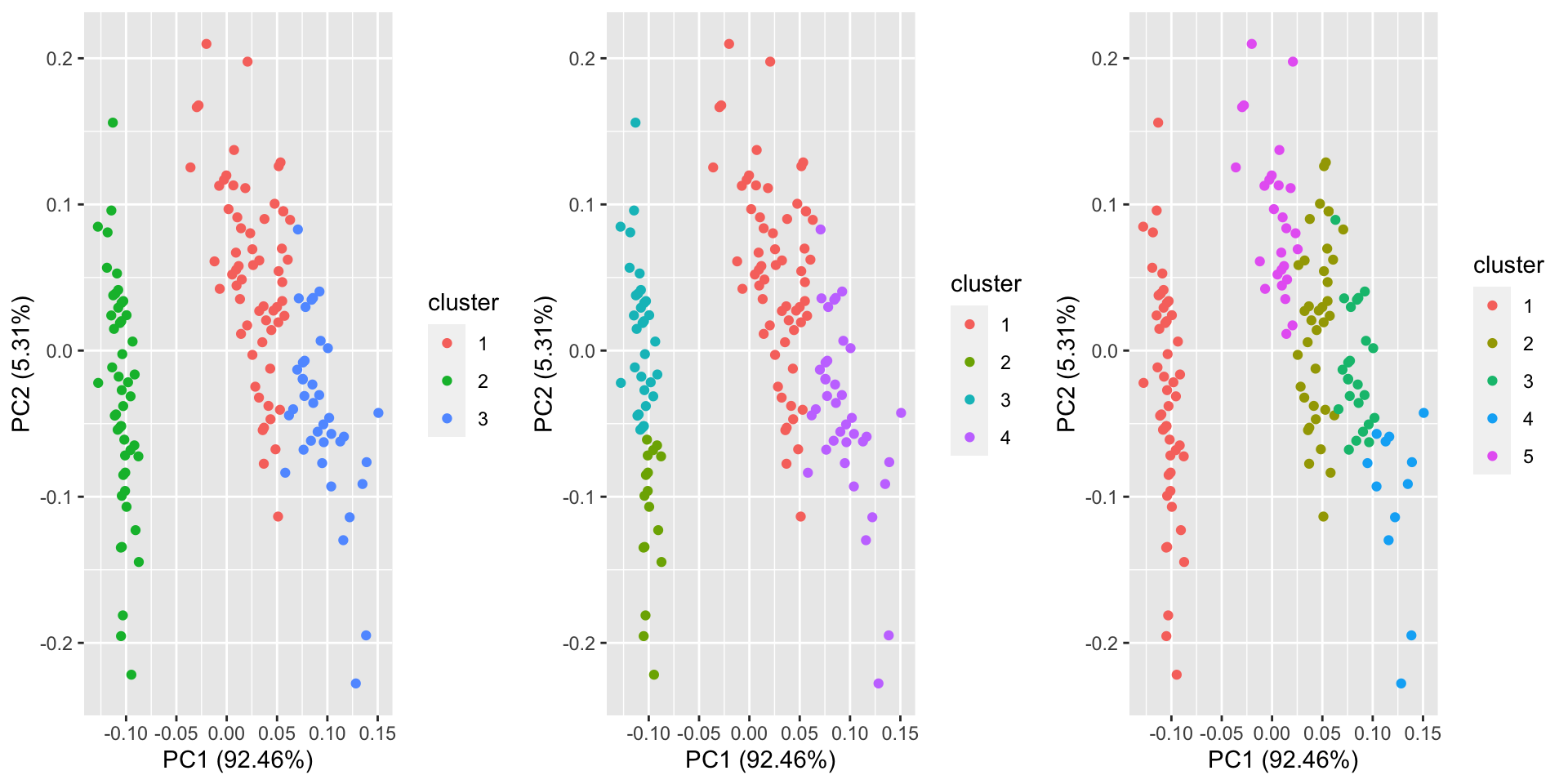
sessionInfo()## R version 4.0.2 (2020-06-22)
## Platform: x86_64-apple-darwin17.0 (64-bit)
## Running under: macOS Mojave 10.14.5
##
## Matrix products: default
## BLAS: /Library/Frameworks/R.framework/Versions/4.0/Resources/lib/libRblas.dylib
## LAPACK: /Library/Frameworks/R.framework/Versions/4.0/Resources/lib/libRlapack.dylib
##
## locale:
## [1] zh_CN.UTF-8/zh_CN.UTF-8/zh_CN.UTF-8/C/zh_CN.UTF-8/zh_CN.UTF-8
##
## attached base packages:
## [1] stats graphics grDevices utils datasets methods base
##
## other attached packages:
## [1] purrr_0.3.4 timeSeries_3062.100 timeDate_3043.102
## [4] vars_1.5-3 lmtest_0.9-38 urca_1.3-0
## [7] strucchange_1.5-2 sandwich_2.5-1 zoo_1.8-8
## [10] MASS_7.3-51.6 lfda_1.1.3 cluster_2.1.0
## [13] ggfortify_0.4.10 ggplot2_3.3.2
##
## loaded via a namespace (and not attached):
## [1] Rcpp_1.0.5 RSpectra_0.16-0 pillar_1.4.6 compiler_4.0.2
## [5] tools_4.0.2 digest_0.6.25 nlme_3.1-148 lattice_0.20-41
## [9] evaluate_0.14 lifecycle_0.2.0 tibble_3.0.3 gtable_0.3.0
## [13] pkgconfig_2.0.3 rlang_0.4.7 Matrix_1.2-18 yaml_2.2.1
## [17] blogdown_0.20 xfun_0.17 gridExtra_2.3 withr_2.2.0
## [21] stringr_1.4.0 dplyr_1.0.1 knitr_1.29 generics_0.0.2
## [25] vctrs_0.3.2 grid_4.0.2 tidyselect_1.1.0 glue_1.4.1
## [29] R6_2.4.1 rARPACK_0.11-0 rmarkdown_2.3 bookdown_0.20
## [33] tidyr_1.1.1 farver_2.0.3 magrittr_1.5 scales_1.1.1
## [37] ellipsis_0.3.1 htmltools_0.5.0 colorspace_1.4-1 labeling_0.3
## [41] stringi_1.4.6 munsell_0.5.0 crayon_1.3.4